
Role:
Lead Web Developer · UX/UI Designer · UX Researcher
Project Timeline:
June 2024 - August 2025
Scope:
End-to-end website and brand rebranding across medical, Department of Defense (DoD), and interior design industries
Overview:
Kalogon is a smart seating technology company operating across medical, DoD, and interior design contexts. As the company expanded its product offerings and refined its sales strategy, the existing website no longer supported its business or its users.
The site had evolved without a clear system. Visual and structural inconsistencies reduced trust, navigation failed to communicate relevance to different industries, and internal teams struggled to scale content efficiently. I led a full website and brand rebranding to realign Kalogon’s digital presence with its technology, users, and business growth.
This work went beyond a visual refresh. I owned research, information architecture, design system implementation, and development, ensuring the final product was clear, accessible, scalable, and maintainable.
-
Layouts, colors, and components were applied inconsistently across pages
-
The experience primarily served wheelchair users, obscuring broader use cases
-
Navigation did not help users quickly identify industry relevance
-
New product launches lacked a repeatable page structure
-
One-off design decisions created long-term design and maintenance debt
Problem:
-
Create clear, industry-aware navigation
-
Establish visual and structural consistency across the site
-
Improve accessibility and readability
-
Support refined personas and conversion pathways
-
Build a scalable system for future products and content
Goals:
-
Partnered with executive leadership and the founder to define goals and personas
-
Conducted UX research and redefined personas aligned with the sales pipeline
-
Rebuilt the site’s information architecture from the ground up
-
Designed and implemented a reusable design system
-
Developed and shipped the website in Wix
-
Managed iteration, QA, and long-term scalability
My Role:
Research:
I began with a full audit of the existing site, evaluating content relevance, accessibility gaps, visual consistency, and user flow friction. In parallel, I conducted structured conversations with executive stakeholders to synthesize business priorities, internal challenges, and future direction.
Key insights:
-
Users needed immediate clarity on whether Kalogon was relevant to their industry
-
Visual inconsistency undermined trust and perceived professionalism
-
The site needed to support both discovery and conversion, not just storytelling
These insights were documented and translated into guiding principles that informed all downstream decisions.
.jpg)
.jpg)
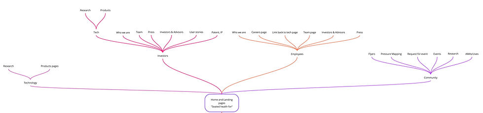
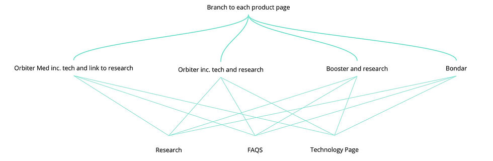
Architecture and User Flows:
In collaboration with leadership, I redefined core user groups to clarify how Kalogon operates across medical, Department of Defense, and interiors contexts. These inputs informed a full rebuild of the site’s information architecture, which was designed to reduce cognitive load and improve clarity across industries.
Key architectural decisions:
-
Designing the homepage as a clear industry-based routing layer, allowing users to quickly self-identify
-
Simplifying navigation to minimize the number of steps required to reach key content
-
Standardizing page hierarchies to create predictable, consistent user flows
-
Removing outdated and redundant pages to reduce friction and maintenance overhead
By prioritizing structure over surface, the redesigned architecture improved wayfinding, supported faster user journeys, and created a scalable foundation aligned with both user needs and business growth.
.png)
UI Design and Implementation:
The visual system was intentionally redesigned, moving from dark, muted tones to light backgrounds with expressive pink and yellow accents to improve accessibility and readability while aligning the brand with a more optimistic, human-centered, and forward-looking identity.
Key UI decisions included:
-
Clear rules for color usage and gradients to prevent inconsistency
-
Consistent spacing, layout patterns, and hierarchy
-
Subtle motion and micro-interactions to reinforce innovation without harming usability
To support scalability, I created a private section library that functioned as a lightweight design system. This included reusable layout patterns, standardized content modules, and consistent CTA components, all with defined usage rules.
From a development perspective, I focused on:
-
Responsive layout patterns that scaled cleanly across breakpoints
-
Clear content modeling to support non-technical updates
-
Accessibility-conscious implementation (contrast, hierarchy, interaction states)
-
Ongoing QA across devices and browsers
Outcome:
The redesigned website delivers a clear, accessible, and scalable experience aligned with Kalogon’s innovation and multi-industry reach.
-
Improved navigation and faster user journeys
-
Stronger brand trust and credibility
-
Increased traffic and engagement
-
A maintainable system supporting future growth
The site now functions as a strategic product and business asset.
Tools Used:
-
Architecture & Mapping: Miro (full site map, page hierarchy, user flows)
-
Structure & IA: Relume (content modeling, page structure validation)
-
Design: Figma (components, variants, auto-layout, responsive frames)
-
Implementation: Wix (Editor X / advanced layout system)
-
Accessinility: UserWay widget, Contrast ratio checker
-
Testing: A/B testing, manual QA across breakpoints and devices